

Chart Labels
The Labels page has the following options:
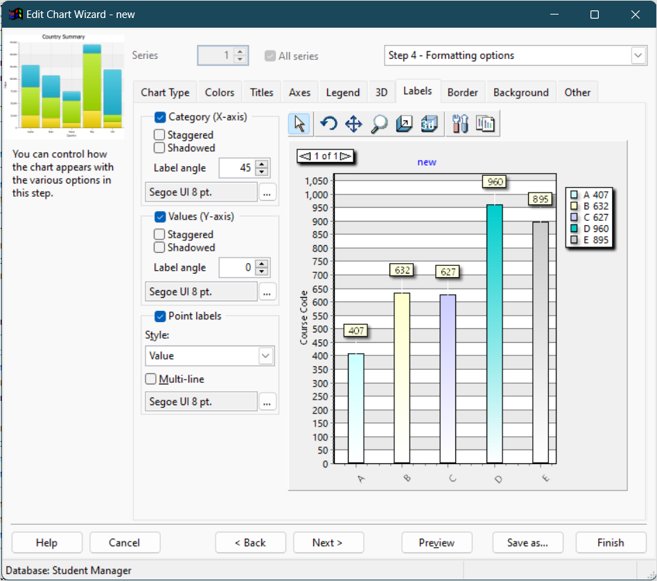
Category (X-axis)_and_Values (Y-axis): turn these options on, which they are by default, to display labels for the values of the X and Y axis.
Staggered: if label names are fairly long, especially in the case of category names, they can overlap each other. Turn this setting on to stagger the labels to minimize the overlap.
Shadowed: turn this setting on to display labels with shadowed text.
Label angle: this option specifies the angle at which the text of the label is displayed. This can also help reduce label overlap. For the X axis, the angle can be 0, 45, 90, -45, and -90. For the Y axis, the choices are 0, 90, and -90.
Font: to change the font or size of the labels, click the button with the ellipsis (...) and select the desired font and size from the dialog that appears. Note that if you select a font script other than Western, the script name (such as "Greek") appears after the font name, size, and style.
Point labels: turn this option on, which it is by default, to display labels for each category in the chart. For all but pie and donut charts, point labels appear at the top of the point for a particular data item in the chart. For pie and donut charts, point labels appear beside each slice.
Style: this setting, which is only available if Point labels is turned on, specifies what is displayed for point labels. The choices are Value, Percent (which shows each value as a percentage of the total), Category (the default), Category & Percent, Category & Value, Percent & Total (which shows each value as a percentage and the total), Category, Percent & Total, and Percent Relative (which shows each value as a percentage of the smallest non-zero value).
Multi-line: turn this setting on to display long point labels on multiple lines rather than a single long line.