

Gauge Report
A gauge report allows you to create a gauge showing the current value of something compared to a target or goal value.
You must have an Ultimate license to create or edit gauge reports.
To create a Gauge Report, follow the steps in the Creating a Report topic, and select the Gauge type.
Step 1 Main Report Information
The first step in this wizard is to enter the following information:
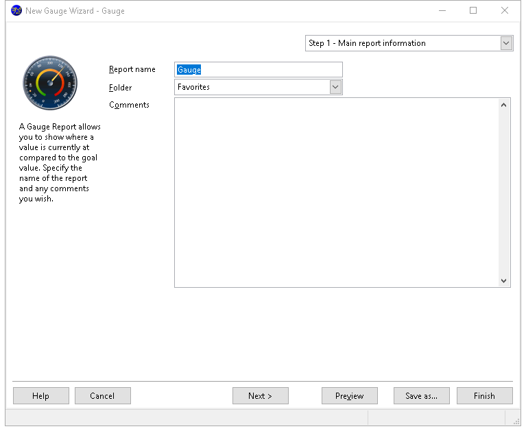
Report name: the name of the report. If you enter the name of an existing report, an error message displays. You can't use a backslash ("\") in a report name; the computer will beep if you press that key. You cannot go to the next step until you have entered a valid report name.
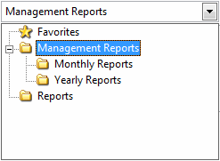
Folder: the folder this report belongs in. The default is the current folder in the Reports Explorer. You can select the desired folder by clicking the down arrow beside the folder name and choosing the folder in the list that appears. To expand a folder, click the + sign in front of the folder name; the + sign changes to a - sign. To collapse a folder, click the - sign in front of the folder name; the - sign changes to a + sign. To select the desired folder, either click it and click the down arrow again to close the list or double-click it.
- Comments: any comments entered here appear in the Reports Explorer when the report is selected.
Step 2 Data Selection
Step 2 allows you to select which fields appear in the report. Each field you select will appear on its own line in the label. Note that if you've turned on Advanced layout in Step 5, the options in this step are disabled (with the exception of the Advanced button) and a message appears indicating why this is the case.
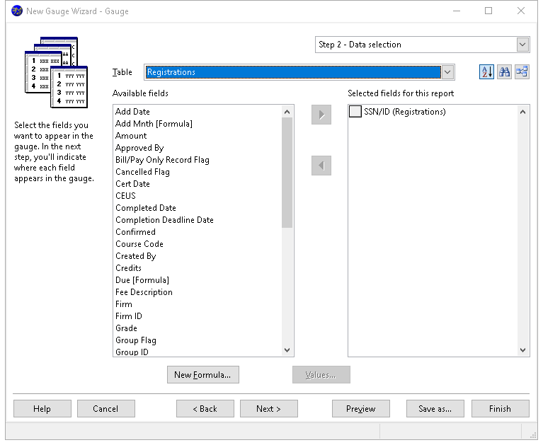
The options in this step are:
Table: a drop-down list that displays the names of the tables you can select fields from.
Sort: Student Manager Reports by default displays fields in alphabetical order. This makes it easy to find a field in the list. However, sometimes it makes more sense to display fields in the order they appear in the table. For example, for typical address fields, you would see this order alphabetically:
Address
City
Contact Name
Country
Customer Name
Postal Code
Region
whereas they'd appear like this in table order:
Customer Name
Contact Name
Address
City
Region
Postal Code
Country
Click this button to display fields in table order. Click it again to display them alphabetically. The setting of this button is remembered, so if you edit a report later, it has the same setting.
Find: a long list of fields can make it difficult to find the ones you're interested in. If you know part of the field caption you're looking for (such as a field with "tax" somewhere in the caption), click this button, enter the text, and click OK. If there are any fields that match, the first one is selected. Press F3 to find the next one containing the same text.
Relation: a long list of tables can make it difficult to find the ones you're interested in. Once you've selected fields from one table, chances are you're next going to select fields from a directly-related table. For example, if you chose a field from Customers, you are more likely to choose a field from Orders than from Products. Click this button to reduce the list of tables to only those directly related to ones you've already selected fields from. Click it again to restore the list to all tables.
Available fields: a list containing all reportable fields from the table shown in the Table list that have not already been selected.
Selected fields for this report: a list showing the fields to be included in the report, with the table the field is from shown in parentheses. Fields in this list may be moved up and down to change the order in which the columns are printed on the report; to do this, click the button in front of the field to move and drag the button up or down in the list.
Add: clicking this button adds the selected field in the Available list to the Selected list. You can select several fields by holding down the Ctrl key as you select them; clicking Add adds all selected fields to the Selected list. You can also add the field by double-clicking it in the Available list, selecting it and pressing Enter, or dragging the field from the Available list to the Selected list. The field is removed from the Available list.
If you select a field from a table that is not related in any way to the other tables involved in the report, you will get a warning message.
Add all: clicking this button adds all fields from the selected table to the Selected list.
Remove: clicking this button removes the selected field (or fields if you have selected more than one) from the Selected list. You can also remove the field by dragging it from the Selected list to the Available list. The field is added to the Available list (although you may not see it if the table the field is from is not the selected table).
Remove all: clicking this button removes all fields from the Selected list, and adds them to the Available list (although you only see those fields from the selected table).
Advanced: click this button to customize how the report runs.
New Formula: click this button to define a new formula. The new formula is automatically added to the report.
Edit Formula: click this button, which appears instead of New Formula when you have selected an existing formula, to edit the formula.
Values: displays a list of the unique values in the field selected in either the Available or Selected list, depending on which one was selected last. This is handy if you're not sure what data a field contains.
Properties: clicking this button displays the Properties dialog. You can also display this dialog by double-clicking the field in the Selected list or selecting it and pressing Enter. This dialog allows you to specify how the field looks, how grouping is performed, and whether summary totals are shown or not. See Field Properties below for more information.
Step 3 Gauge Layout
In Step 3, you specify which field determines the current value and which field or what value determines the target or goal value.
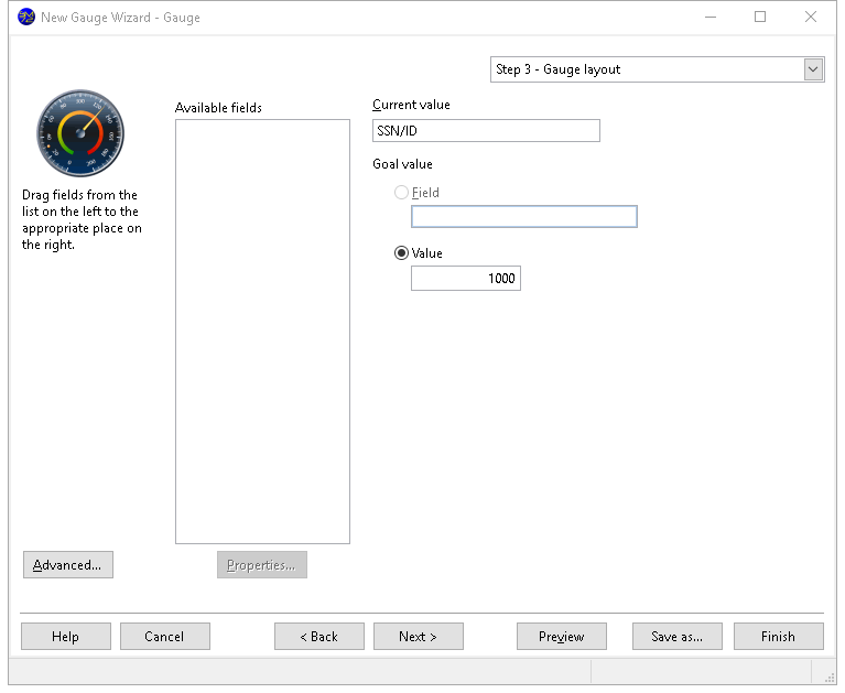
To specify where a field goes, drag its name from the list on the left to the appropriate place at the right. For example, to use the Amount field as the current value field, click it in the list, hold down the mouse button, and move the mouse until it's over the box below the word "Current value," then let go of the mouse.
To remove a field from a place on the report, drag it from the appropriate box back to the list at the left or select it and press the Delete key.
The goal value can either come from a field or from a value. Select Field and drag a field to the box underneath Field to use the specified field. Select Value to enter a value to use for the goal.
To change how a field appears in the report, select it and click the Properties button. This displays the Properties dialog. You can also display this dialog by double-clicking the field or selecting the field and pressing Enter.
Field Properties
The Properties dialog allows you to specify how the field appears in the report. You can display this dialog for the highlighted field by clicking the Properties button in Step 3 of the Gauge Wizard, double-clicking the field, or selecting the field and pressing Enter.
Display Page
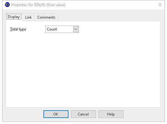
The options in the Display page of this dialog are:
Total type: this option allows you to specify whether a total ("sum"), average, highest, lowest, or count value appears for this field. Only Count is available for non-numeric fields. Set Total type to None if, instead of displaying summarized values, you want individual values charted.
Use default format: if this option is turned on, which it is by default, Student Manager Reports uses the defined format for the field. If the format for the field changes in the future, the report uses the new format automatically. If you wish to change any of the formatting options, turn this setting off. The formatting options are only available for the current field.
Show 1000s separator: if this option is turned on, the values in the field are formatted with the thousands separator defined in the Regional Settings applet of the Windows Control Panel.
Display $: turning this option on displays the currency symbol defined in the Regional Settings applet of the Windows Control Panel in front of the field's value.
Decimal places: the number of decimals to display.
Links Page
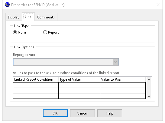
The Link page allows you to link the gauge to another report. When you click the gauge in the Preview window, the specified report is run.
The options on this page are disabled unless you set Link Type to Report. The options are:
Link Type: choose Report to link to a report or None to turn off linking.
Report to run: this option specifies which report to run when you click the gauge in the Preview window. Click the down arrow and select the report from the list; you have to expand the folder the desired report is in to select the report. When you've found the desired report, double-click it or select it and click the down arrow to close the report selector.
Values to pass: this option allows you to pass values to the ask-at-runtime filter conditions of the linked report. The list shows each of the ask-at-runtime conditions for the linked report. The first column shows the field used in the ask-at-runtime condition, the second column allows you to specify the type of value to pass to the report, and the third column specifies the value to pass. The choices for the Type of Value column are:
- None, which means a value won't be passed to this condition, so you are still prompted for its value.
- Filter Condition, which means this report contains the same ask-at-runtime filter condition as the linked report, and you want the value you specify when you run this report passed to the linked report. For example, if both reports have an ask-at-runtime filter condition on the order date, you'd want to use the same order date range you specify when you run this report used for the linked report. So, choose Filter Condition and select the field used for the condition in the Value to Pass column.
- Field, which means you want to pass the value of the field specified in the Value to Pass column for the current record.
- Ignore this condition, which means you want to ignore this condition (that is, act like you clicked the Ignore this condition option in the filter value dialog) and not display the dialog asking you for the value for this condition.
Note: Only fields selected for the report appear in the list of fields in the Value to Pass column, so be sure to include the desired field in the report.
Comments Page
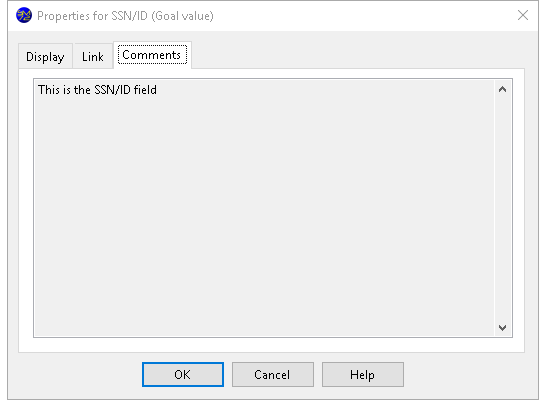
The Comments page shows any comments about the field, which is often used to provide a description of the field's contents.
Step 4 Formatting Options
Step 4 allows you to specify how the gauge appears. There are many options in this step but they are organized into groups.
As you make changes to the various options in this step, the gauge displayed automatically adjusts to show you what the gauge looks like using your settings. However, it does not show actual data from your database until you click the Preview button.
Options Page
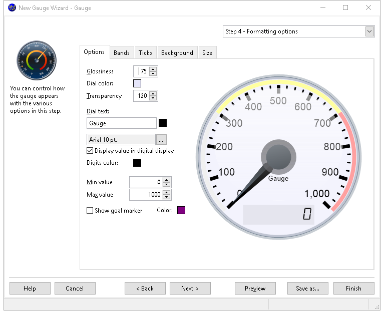
The following options are available on the Options page:
Glossiness: an ellipse appears at the top of the gauge to make it appear shiny. This option determines how "glossy" this ellipse appears. The values are 0 (no shine) to 100 (very glossy).
Dial color: this determines the color of the gauge inside the dial area. To change the color, click the colored square and select the desired color from the dialog that appears.
Transparency: this option specifies the transparency of the dial color. 0 is opaque and 255 is completely transparent.
Dial text: specifies the text, color, and font for the text that appears inside the gauge below the pointer. The default text is the name of the report. To change it, type something different in the text box. Blank the box to display no text. To change the color of the text, click the colored square beside the text and select the desired color from the dialog that appears. To change the font or size, click the button with the ellipsis (...) and select the desired font and size from the dialog that appears. Note that if you select a font script other than Western, the script name (such as "Greek") appears after the font name, size, and style.
Display value in digital display: turn this on to display the current value in a digital display at the bottom of the gauge, similar to the odometer in a car's speedometer. Note there's only room for seven digits in the display.
Digits color: specifies the color of the digits in the digital display. To change the color, click the colored square beside the title and select the desired color from the dialog that appears.
Min value: specifies the minimum value for the gauge. The default is 0.
Max value: specifies the maximum value for the gauge. The default is the goal value if it's specified as a value or 100 if it's a field.
Show goal marker: turn this on to display a diamond shape on the gauge where the goal value is. To change the color of the marker, click the colored square and select the desired color from the dialog that appears.
Bands Page
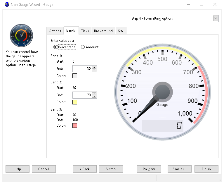
Around the edge of the gauge are three colored bands, indicating a range of values. The Bands page allows you to control the size and colors of these bands. It has the following options:
Enter values as: this option allows you to specify whether the values on this page are in percentage or as amounts.
Start: the starting value for the band. You can't change this value: for band 1, it's 0; for band 2, it's the same as the ending value for band 1; and for band 3, it's the same as the ending value for band 2.
End: the ending value for the band. Start and End together form the range for the band. For example, for band 2, if Start is 40 and End is 70, the section of the gauge between 40% and 70% of the total appears in the color specified for the band. The end value for band 3 is fixed at 100.
Color: the color for the band. To change the color, click the colored square and select the desired color from the dialog that appears.
Ticks Page
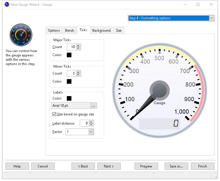
The Ticks page has the following options:
Major ticks: specifies the number and color of the major ticks. To change the color, click the colored square and select the desired color from the dialog that appears.
Minor ticks: specifies the number and color of the minor ticks. To change the color, click the colored square and select the desired color from the dialog that appears.
Labels: specifies the color and font of the labels in the gauge. To change the color, click the colored square and select the desired color from the dialog that appears. To change the font or size, click the button with the ellipsis (...) and select the desired font and size from the dialog that appears. Note that if you select a font script other than Western, the script name (such as "Greek") appears after the font name, size, and style.
Size based on gauge size: if this option is turned on, which it is by default, the font size setting for labels is ignored and instead the font size is based on the size of the gauge: the larger the gauge, the larger the font size. Turn this option off to use the specified font size for labels.
Label distance: the distance of the labels from the major tick marks.
Factor: a divisor for the label values. For example, if you select "1,000" from the list, values are shown in thousands (for example, 125,000 shows as 125). Choose "1" to show the actual values.
Background Page
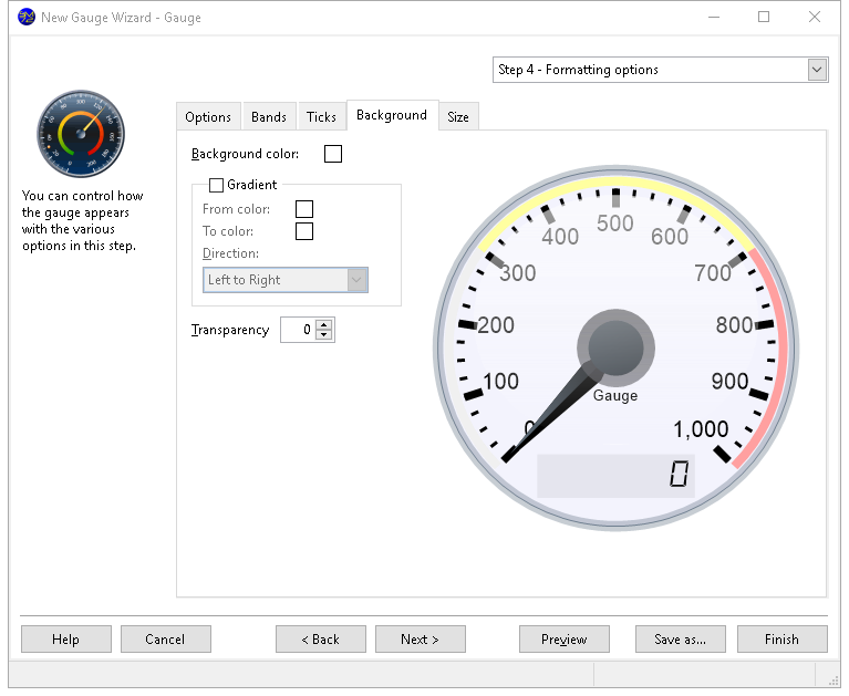
The Background page has the following options:
Background color: this setting, which is only available when Gradient is turned off, specifies the color of the gauge background. To change the color, click the colored square beside this setting and select the desired color from the dialog that appears.
Gradient: turn this setting on to display a gradient of color across the gauge background.
From color: this option, which is only available if Gradient is turned on, specifies the starting color for the gradient. To change the color, click the colored square beside this setting and select the desired color from the dialog that appears.
To color: this option, which is only available if Gradient is turned on, specifies the ending color for the gradient. To change the color, click the colored square beside this setting and select the desired color from the dialog that appears.
Direction: this option, which is only available if Gradient is turned on, specifies in which direction the gradient flows. The choices are Left to Right, Top to Bottom, From Top Left, and From Top Right.
Transparency: this option specifies the transparency amount. 0 is opaque and 255 is completely transparent.
Size Page
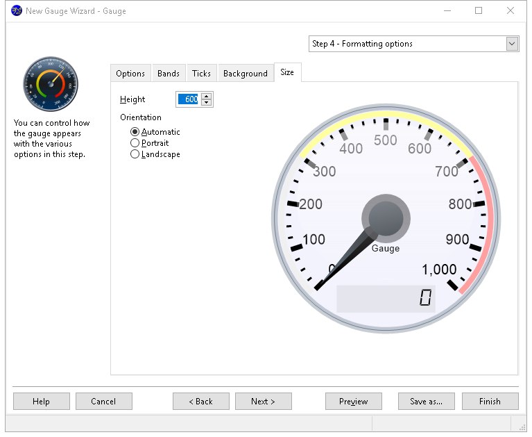
The Size page has these options:
Height: specifies the height (and width, since they're always the same) of the gauge in pixels when it's output.
Orientation: the default choice, "Automatic," means that if the gauge is too wide to fit in portrait orientation, it automatically switches to landscape. However, you can override this by choosing either "Portrait" or "Landscape" to force the report to be printed in the desired orientation.
Step 5 Standard Filter Options
Step 5 allows you to specify a filter used by default for this report. You can skip this step if no filter is normally used.
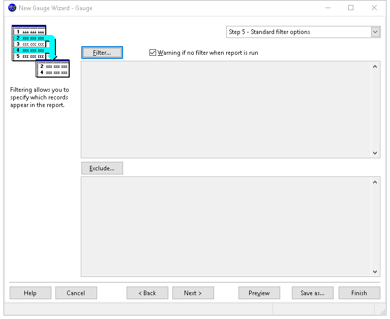
To specify a filter, click the Filter or Exclude button, and enter the filter conditions using the same procedures described in the Filter Records topic.
Step 6 Security Options
The options in Step 6 allow you to determine who can access your report and what they can do with it.
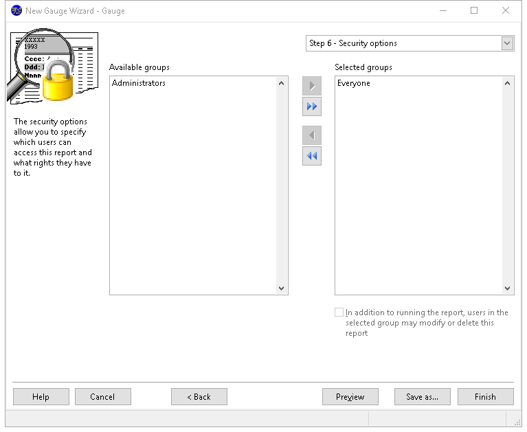
The options in this step are:
Available groups: this shows which user groups do not have access to this report.
Selected groups: this shows which user groups have access to this report. By default, the Everyone group has access to a new report, so all users can see it. If you want only certain users to see it, remove the Everyone group from the Selected list and add the appropriate groups from the Available list. If no groups have access to the report, the report is essentially private, available only to you.
Add: clicking this button adds the selected group in the Available list to the Selected list. You can select several groups by holding down the CTRL key as you select them; clicking Add adds all selected groups to the Selected list. You can also add the group by double-clicking it in the Available list, selecting it and pressing ENTER, or dragging the group from the Available list to the Selected list. The group is removed from the Available list.
Add all: clicking this button adds all groups from the Available list to the Selected list.
Remove: clicking this button removes the selected group (or groups if you have selected more than one) from the Selected list. You can also remove the group by dragging it from the Selected list to the Available list. The group is added to the Available list.
Remove all: clicking this button removes all groups from the Selected list, and adds them to the Available list.
In addition to running the report, users in the selected group may modify or delete this report: turn this option on if the selected group in the Selected list can edit or delete this report; if this item is turned off, only you are able to do so.