

Chart Report
Student Manager Reports can create charts and graphs from data in your database. For example, you may want to see a breakdown of your sales by product. You can graph this information as a pie chart, a bar chart, or one of the other chart types to suit your needs.
You must have a Premium or Ultimate license to create or edit chart reports.
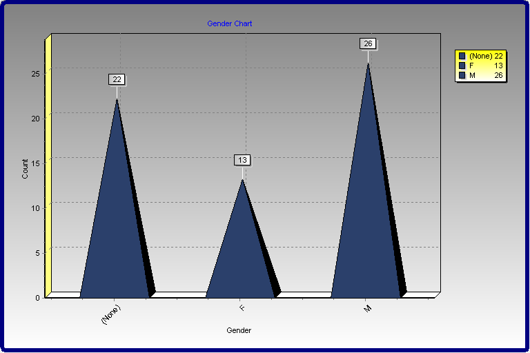
Here's an example of a chart:
To create a chart report, select at least two fields you want to appear in the chart, and then select where each field goes. There are three places a field can appear:
A category field appears in the category, or X, axis of all but pie charts. For pie charts, a category field is used for the slices. For example, to show a chart of sales by product by year, use the product name as the category field.
A values field is the numeric value for each category item in the chart. For pie charts, this is used to determine the size of a slice. For all other charts, it's used for the values, or Y, axis. For example, to show a chart of sales by product by year, use the sale amount as the values field.
A series field is used to create multiple charts. For example, to show a chart of sales by product by year, use the sale date as the series field and display the year rather than individual dates using the Properties dialog. Not all charts have a series field.
Here are some notes about how charts work:
You can specify how the values field is summarized. For numeric fields, the default is to sum the values. For all other types of fields, you can only have it count the number of values.
If you use a date field as the category or series field, you can specify how the date is displayed. For example, you may want to show the month or year rather than individual dates.
Series are optional. If you don't specify a series field, the chart will only have one series.
To create a Chart Report, follow the steps in the Creating a Report topic, and select the Chart report type.
Step 1 Main Report Information
The first step in this wizard is to enter the following information:
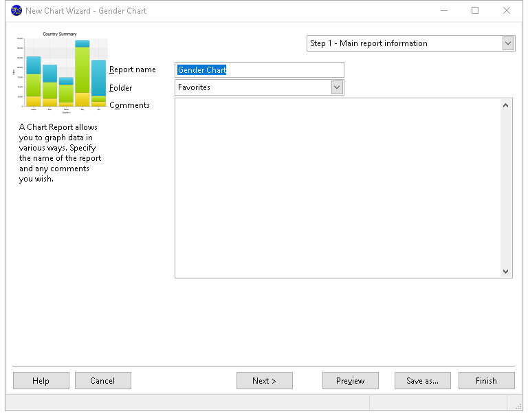
Report name: the name of the report. If you enter the name of an existing report, an error message displays. You can't use a backslash ("\") in a report name; the computer will beep if you press that key. You cannot go to the next step until you have entered a valid report name.
Folder: the folder this report belongs in. The default is the current folder in the Reports Explorer. You can select the desired folder by clicking the down arrow beside the folder name and choosing the folder in the list that appears. To expand a folder, click the + sign in front of the folder name; the + sign changes to a - sign. To collapse a folder, click the - sign in front of the folder name; the - sign changes to a + sign. To select the desired folder, either click it and click the down arrow again to close the list or double-click it.
- Comments: any comments entered here appear in the Reports Explorer when the report is selected.
Step 2 Data Selection
Step 2, in which you select which fields appear in the report, is shown below:
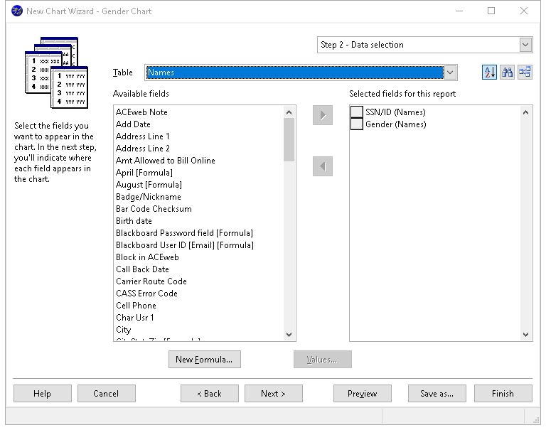
The options in this step are:
Table: a drop-down list that displays the names of the tables you can select fields from.
Sort: Student Manager Reports by default displays fields in alphabetical order. This makes it easy to find a field in the list. However, sometimes it makes more sense to display fields in the order they appear in the table. For example, for typical address fields, you would see this order alphabetically:
Address
City
Contact Name
Country
Customer Name
Postal Code
Region
whereas they'd appear like this in table order:
Customer Name
Contact Name
Address
City
Region
Postal Code
Country
Click this button to display fields in table order. Click it again to display them alphabetically. The setting of this button is remembered, so if you edit a report later, it has the same setting.
Find: a long list of fields can make it difficult to find the ones you're interested in. If you know part of the field caption you're looking for (such as a field with "tax" somewhere in the caption), click this button, enter the text, and click OK. If there are any fields that match, the first one is selected. Press F3 to find the next one containing the same text.
Relation: a long list of tables can make it difficult to find the ones you're interested in. Once you've selected fields from one table, chances are you're next going to select fields from a directly-related table. For example, if you chose a field from Customers, you are more likely to choose a field from Orders than from Products. Click this button to reduce the list of tables to only those directly related to ones you've already selected fields from. Click it again to restore the list to all tables.
Available fields: a list containing all reportable fields from the table shown in the Table list that have not already been selected.
Selected fields for this report: a list showing the fields to be included in the report, with the table the field is from shown in parentheses. Fields in this list may be moved up and down to change the order in which the columns are printed on the report; to do this, click the button in front of the field to move and drag the button up or down in the list.
Add: clicking this button adds the selected field in the Available list to the Selected list. You can select several fields by holding down the CTRL key as you select them; clicking Add adds all selected fields to the Selected list. You can also add the field by double-clicking it in the Available list, selecting it and pressing ENTER, or dragging the field from the Available list to the Selected list. The field is removed from the Available list.
If you select a field from a table that is not related in any way to the other tables involved in the report, you will get a warning message.
Add all: clicking this button adds all fields from the selected table to the Selected list.
Remove: clicking this button removes the selected field (or fields if you have selected more than one) from the Selected list. You can also remove the field by dragging it from the Selected list to the Available list. The field is added to the Available list (although you may not see it if the table the field is from is not the selected table).
Remove all: clicking this button removes all fields from the Selected list, and adds them to the Available list (although you only see those fields from the selected table).
Advanced: click this button to customize how the report runs.
New Formula: click this button to define a new formula. The new formula is automatically added to the report.
Edit Formula: click this button, which appears instead of New Formula when you have selected an existing formula, to edit the formula.
Values: displays a list of the unique values in the field selected in either the Available or Selected list, depending on which one was selected last. This is handy if you're not sure what data a field contains.
Properties: clicking this button displays the Properties dialog. You can also display this dialog by double-clicking the field in the Selected list or selecting it and pressing ENTER. This dialog allows you to specify how the field looks, how grouping is performed, and whether summary totals are shown or not. See Field Properties below for more information.
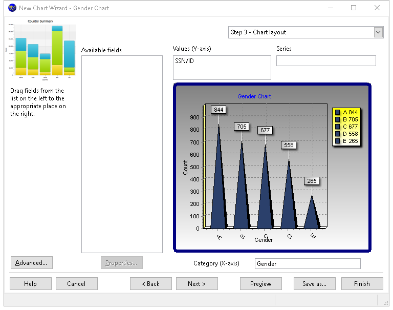
Step 3 Chart Layout
In Step 3, you specify which fields appear in which places in the chart. There are three places a field can appear:
- Category: A category field appears in the category, or X, axis of all but pie charts. For pie charts, a category field is used for the slices. For example, to show a chart of sales by product by year, use the product name as the category field.
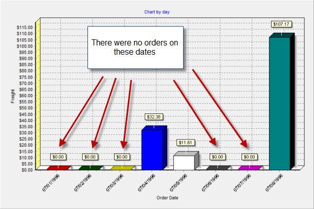
If you use a date or date/time field as a category field and the Add missing date values setting for that field is turned on (the default), missing values are automatically added to the chart, and the range of those values respects any date filter you use. For example, in the following chart, the only dates that had orders were 07/04, 07/05, and 07/08, but the filter condition was Order Date is between 07/01/1996 and 07/08/1996, so all days between those dates appear whether they had any orders or not:
Values: A values field is the numeric value for each category item in the chart. For pie charts, this is used to determine the size of a slice. For all other charts, it's used for the values, or Y, axis. For example, to show a chart of sales by product by year, use the sale amount as the values field. You can chart different fields by using more than one field as a values field. For example, you could chart the total sales and the number of invoices.
Series: A series field is used to create multiple charts. For example, to show a chart of sales by product by year, use the sale date as the series field and display the year rather than individual dates using the Properties dialog. Not all charts have a series field, and if the chart has more than one values field, it can't have a series field.
To specify where a field goes, drag its name from the list on the left to the appropriate place at the right. For example, to use the Amount field as the values field, click it in the list, hold down the mouse button, and move the mouse until it's over the box below the word "Values," then let go of the mouse. Note that you're allowed to have more than one values field; each field is charted as a separate series.
To remove a field from a place on the report, drag it from the appropriate box back to the list at the left or select it and press the Delete key.
To change how a field appears in the report, select it and click the Properties button. This displays the Properties dialog. You can also display this dialog by double-clicking the field or selecting the field and pressing ENTER.
Step 3 shows a sample of what the chart looks like based on the fields you've selected and their properties. However, it does not show actual data from your database until you click the Preview button.
Field Properties
The Properties dialog allows you to specify how the field appears in the report. You can display this dialog for the highlighted field by clicking the Properties button in Step 3 of the Chart Wizard, double-clicking the field, or selecting the field and pressing ENTER.
Display Page
The options in the Display page of this dialog are:
- Total type: this option, which is only available for values fields, allows you to specify whether a total ("sum"), average, highest, lowest, count, or count distinct value appears for this field. Only Count and Count Distinct are available for non-numeric fields.
The difference between Count and Count Distinct is that Count counts the number of records while Count Distinct counts the number of records having unique values on this field. For example, if there are 100 order records but all orders were placed this week, using Count on the Order Date field would display 100 but Count Distinct would display 7 (assuming at least one order was placed every day this week).
Set Total type to None if, instead of displaying summarized values, you want individual values charted. For example, the following chart has Total type set to None, so you can see two orders on 07/08:
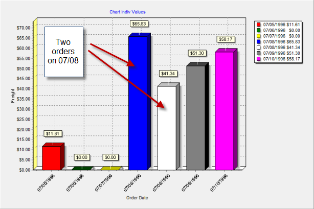
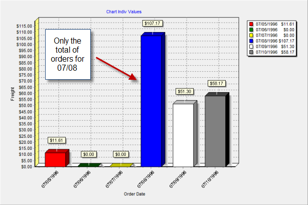
The following chart has Total type set to Sum so the total of orders for 07/08 is displayed instead:
Sorting: this option, which is only available for values fields and only if there's just one values field and no series fields, allows you to specify whether the chart is sorted by the category (the Not Sorted setting, which is the default) or in ascending or descending order by value.
Axis for scale: this option, which is only available for values fields, specifies whether the left or right axis is used for the scale for this field. This is normally set to Left but if you use more than one values field, you may want to set one of them to Right, especially if the range of values is significantly different between the fields.
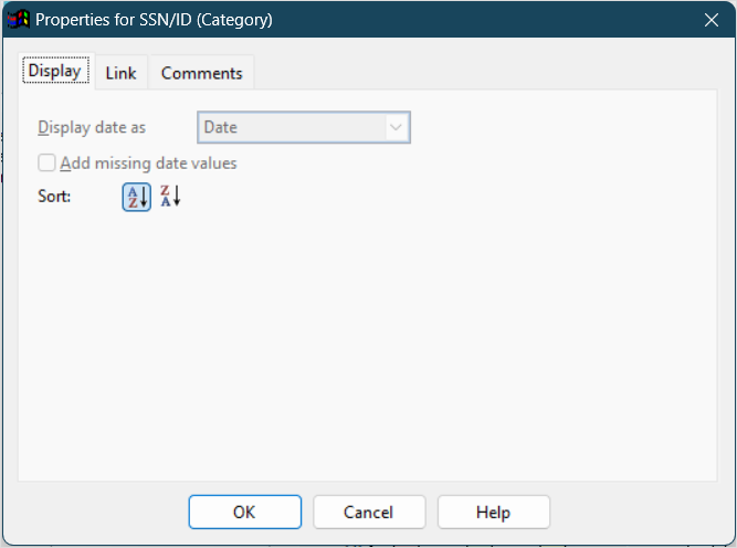
Display date as: this option, which is only available for date fields used as categories or series, allows you to specify whether the actual date is displayed ("Date") or whether the results are summarized by hour, day, week, month, month and year, quarter, year, or fiscal year. Choose the desired function from the drop-down list.
If you choose "Week," the Week starts on setting in the Options dialog determines which day a week starts on. If you choose "Quarter" or "Fiscal Year," the Year starts in setting determines which quarter number or year a date falls in.
- Add missing date values: if this option, which is only available for date fields used as categories, is turned on, missing values are automatically added to the chart, and the range of those values respects any date filter you use. For example, in the following chart, the only dates that had orders were 07/04, 07/05, and 07/08, but the filter condition was Order Date is between 07/01/1996 and 07/08/1996, so all days between those dates appear whether they had any orders or not:
- Sort: click the Ascending button to sort this field from lowest to highest, or the Descending button to sort from highest to lowest. This option is only available for category and series fields.
Format Page
The options in the Format page of this dialog, which only appears for values fields, are:
Use default format: if this option is turned on, which it is by default, Student Manager Reports uses the defined format for the field. If the format for the field changes in the future, the report uses the new format automatically. If you wish to change any of the formatting options, turn this setting off.
Show 1000s separator: if this option is turned on, the values in the field are formatted with the thousands separator defined in the Regional Settings applet of the Windows Control Panel.
Display $: turning this option on displays the currency symbol defined in the Regional Settings applet of the Windows Control Panel in front of the field's value.
Decimal places: the number of decimals to display.
Links Page
The Link page, which only appears for category fields and only if the chart isn't included in a quick or cross-tab report, allows you to link a category (for example, a bar in a column chart or a slice in a pie chart) to another report, commonly known as a "drilldown." When you move the mouse pointer over a linked category in the Preview window, it appears as a hand so you can tell that clicking it causes the linked report to run. The options on this page are disabled unless you set Link Type to Report.
The options in this page are:
Link Type: choose Report to link to another report.
Report to run: this option specifies which report to run when you click the category in the Preview window. Click the down arrow and select the report from the list; you have to expand the folder the desired report is in to select the report. When you've found the desired report, double-click it or select it and click the down arrow to close the report selector.
Values to pass: this option allows you to pass values to the ask-at-runtime filter conditions of the linked report. Without this option, when you click a category linked to another report, that report prompts you for any of its ask-at-runtime filter conditions, which may not make sense. For example, suppose you have a chart showing sales by country and you've linked the country field to a report showing sales for that specific country. The linked report has an ask-at-runtime filter condition on the country name, so when you click a country in the chart, the linked report runs and asks you for the country name. That seems odd, because you just clicked a particular country and now it wants you to specify which country. To make this more seamless, you want to tell the linked report which country you just clicked. You do that by specifying what value to pass to the ask-at-runtime filter condition of the linked report. In this case, you'd specify that the country should be passed to the linked report. Since that value is passed, the report doesn't need to ask you for the country name, and simply displays the sales for the country you clicked.
The list shows each of the ask-at-runtime conditions for the linked report. The first column shows the field used in the ask-at-runtime condition, the second column allows you to specify the type of value to pass to the report, and the third column specifies the value to pass. The choices for the Type of Value column are:
- None, which means a value won't be passed to this condition, so you'll still be prompted for its value.
- Filter Condition, which means this report contains the same ask-at-runtime filter condition as the linked report, and you want the value you specify when you run this report passed to the linked report. For example, if both reports have an ask-at-runtime filter condition on the order date, you'd want to use the same order date range you specify when you run this report used for the linked report. So, choose Filter Condition and select the field used for the condition in the Value to Pass column.
- Field, which means you want to pass the value of the field specified in the Value to Pass column for the current record. For example, when you click the company name, you want to pass the customer number to the ask-at-runtime filter condition on customer number to the linked report, so choose Field and select the Customer Number field in the Value to Pass column.
- Ignore this condition, which means you want to ignore this condition (that is, act like you clicked the Ignore this condition option in the filter value dialog) and not display the dialog asking you for the value for this condition.
Note that only fields selected for the report appear in the list of fields in the Value to Pass column, so be sure to include the desired field in the report. If that field is in the Available fields list, it won't actually appear in the report but will be retrieved from the database.
Comments Page
The Comments page shows any comments about the field, which is often used to provide a description of the field's contents.
Step 4 Formatting Options
Step 4 allows you to specify how the chart appears. There are many options in this step but they are organized into groups. A complete chart editor dialog is also available to provide complete control over the chart's appearance.
The Series option at the top of Step 4 selects which series the settings apply to; this option is disabled if you did not select a series field in Step 3. This option allows you to format each series chart individually. For example, you could chart the first series as a bar chart, the second as a line chart, and the third as an area chart. If the All series option is turned on, changes in Step 4 affect all series of the chart.
As you make changes to the various options in this step, the chart displayed in this step automatically adjusts to show you what the chart looks like using your settings. However, it does not show actual data from your database until you click the Preview button.
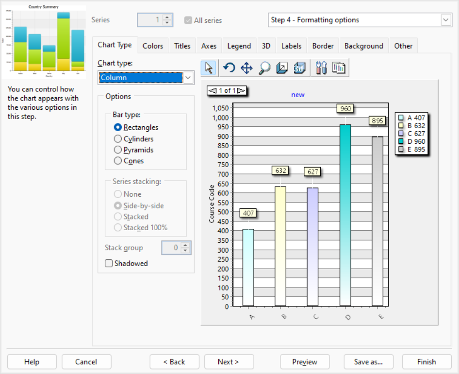
The first option on the Chart Type page is Chart type. Select the type of chart you want from the drop-down list. The choices are Area, Bar, Column (the default chart type), Donut, Line, Pie, and Point. How do you decide what type of chart to create? It depends on the type of data you have and how you want to present it. The Extreme Presentation Method blog ↗️ has a diagram that illustrates the type of chart to choose based on what you want to show. Understanding Stacked Bar Charts: The Worst Or The Best? ↗️ discusses the use of stacked bar charts.
Some options only apply to certain chart types. The following are available for area charts:
Point type: this option specifies the shape of each point in the chart. The choices are None, Rectangles, Circles, and Triangles.
Series stacking: this option, which is only available if the chart has more than one series or more than one values field, allows you to stack series on top of each other rather than having them appear front to back. None means no stacking, Stacked means the series are stacked on top of each other, and Stacked 100% means the series are stacked so the each point is shown relative to the sum of that point in all series.
Stack group: this option, which is only available if the chart has more than one series, allows you to group series together. All the series with the same stack group value are treated the way the Series stacking option specifies. For example, if series 1, 2, and 3 all have Stack group set to 1 and series 4 and 5 have it set to 2, the first three series are stacked together and behind them, the last two series are stacked together. This option is disabled if All series is selected, as it applies to a specific series. Select a series from the Series option, then set Stack group as desired.
The following options are available for bar and column charts:
Bar type: this option allows you to specify what shape to use for bars or columns. The choices are Rectangles, Cylinders, Pyramids, or Cones.
Series stacking: this option, which is only available if the chart has more than one series, allows you to stack series on top of each other rather than having them appear front to back. None means no stacking, Side-by-side means the series are stacked beside each other, Stacked means the series are stacked on top of each other, and Stacked 100% means the series are stacked so the each point is shown relative to the sum of that point in all series.
Stack group: this option, which is only available if the chart has more than one series, allows you to group series together. All the series with the same stack group value are treated the way the Series stacking option specifies. For example, if series 1, 2, and 3 all have Stack group set to 1 and series 4 and 5 have it set to 2, the first three series are stacked together and behind them, the last two series are stacked together. This option is disabled if All series is selected, as it applies to a specific series. Select a series from the Series option, then set Stack group as desired.
Shadowed: turn this setting on to display a shadow for the bars or columns.
The following options are available for pie and donut charts:
Circled: if this option is turned on, the chart appears as a circle; turn it off to display an oval instead.
Group slices: this option allows you to group slices together. For example, suppose you have three large slices and ten small ones. You might want the small ones grouped together into one slice called, for example, "Other" or "Miscellaneous." Group slices has three settings: None (no grouping), Below Percent (all slices below a certain percentage of the total are grouped together), and Below Value (all slices below a certain value are grouped together).
Value: the value used when Group slices is set to Below Percent or Below Value.
Label: the label for the slice that combines smaller slices. The default is "Other."
Shadowed: turn this setting on to display a shadow for the slices.
The only option for line and point charts is Point type, which specifies the shape of each point in the chart. The choices are None, Rectangles, Circles, and Triangles.
See the other Pages:
Step 5 Filter Options
Step 5 allows you to specify a filter used by default for this report. You can skip this step if no filter is normally used.
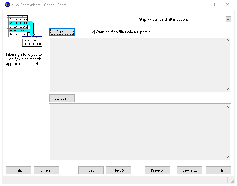
To specify a filter, click the Filter or Exclude button, and enter the filter conditions using the same procedures described in the Filter Records topic.
6 Security Options
The options in Step 6 allow you to determine who can access your report and what they can do with it.
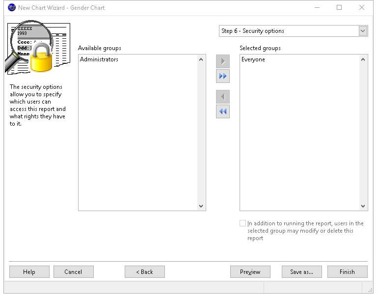
The options in this step are:
Available groups: this shows which user groups do not have access to this report.
Selected groups: this shows which user groups have access to this report. By default, the Everyone group has access to a new report, so all users can see it. If you want only certain users to see it, remove the Everyone group from the Selected list and add the appropriate groups from the Available list. If no groups have access to the report, the report is essentially private, available only to you.
Add: clicking this button adds the selected group in the Available list to the Selected list. You can select several groups by holding down the CTRL key as you select them; clicking Add adds all selected groups to the Selected list. You can also add the group by double-clicking it in the Available list, selecting it and pressing ENTER, or dragging the group from the Available list to the Selected list. The group is removed from the Available list.
Add all: clicking this button adds all groups from the Available list to the Selected list.
Remove: clicking this button removes the selected group (or groups if you have selected more than one) from the Selected list. You can also remove the group by dragging it from the Selected list to the Available list. The group is added to the Available list.
Remove all: clicking this button removes all groups from the Selected list, and adds them to the Available list.
In addition to running the report, users in the selected group may modify or delete this report: turn this option on if the selected group in the Selected list can edit or delete this report; if this item is turned off, only you are able to do so.