

Report Charts
The Chart feature allows you to create a printable chart from a specific report.
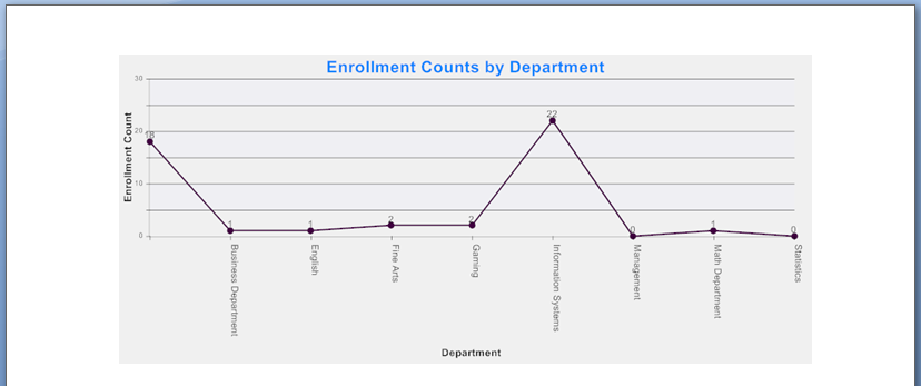
Printed Chart:
Creating Chart Report
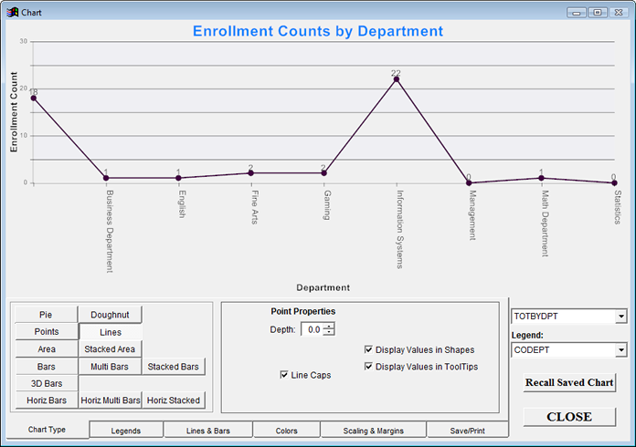
The Chart report may require a JUSTDOIT that groups by your desired values. For example, the above chart has a JUSTDOIT that sums enrollment for all courses in your query and reports it by the course Department.
justdoit('select *,sum(coenrolled) as totbydpt,0 as marker from (cursor5) group by codept order by codept into cursor(cursor5)')
The Chart report always requires the following JUSTAFTER:
justafter('=dochart()').
Please contact your ACEware technician for help in creating a Chart report (before contacting your technician, please determine exactly what you want to report in your chart).
Setting X and Y Values
X and Y axis Field values are set in the drop downs on the lower right of the Chart screen. The Y Axis is the numeric field you are evaluating with your chart (e.g. the enrollment count in the above example). The X Axis is the category the numbers are based on (e.g. Department in the above example).
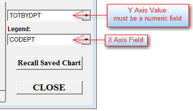
Chart Tabs
- Chart Type - set the chart type (e.g. pie, lines, etc.).
- Legends - enter chart Titles, X and Y Captions, and set text style and colors.
- Lines & Bars - set line/bar styles and colors
- Colors - set object and background colors.
- Scaling & Margins - set chart scaling and margins for printing.
- Save/Print - output the chart as HTML, copy chart to clipboard (for pasting into document), send it to the default printer, save the chart (as a bmp image file), and save chart properties (to re-run chart at a later time).